What actually belongs on a sales dashboard, and what to cut.
Most dashboards show what's easy to count. This one is built around five questions leadership decides on, the named report in HubSpot or Pipedrive that answers each, and what to leave off.
 Toni MedicSalestructSeptember 30, 20268 min readCRM & Pipeline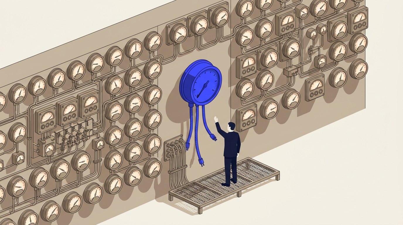
A sales dashboard is easy to fill and hard to build. Every CRM ships dozens of reports you can drop onto one, and almost all of them count something: calls made, emails sent, deals created. None of that tells a sales leader what to do differently next week. This is a field guide to the other kind: five questions a dashboard should actually answer, the named report in HubSpot or Pipedrive that answers each one, and what to leave off because it measures activity instead of deciding anything.
The short version
- A dashboard earns its place on a screen leadership actually opens by answering a question, not by displaying a metric. Five questions cover most of what a sales leader decides on weekly: pipeline entry, meeting completion, stage stalls, conversion, and cost per customer.
- HubSpot names a report for four of the five: Deals created, Team activity (meeting completion rate), Time spent in deal stage, and Deal funnel. Pipedrive names its own equivalents: Lead performance, Activities performance, Deal duration, and Deal conversion.
- Neither vendor publishes a cost-per-customer report. It isn't in HubSpot's sales analytics suite or Pipedrive's Insights report list, because neither CRM holds ad spend or payroll data. A cost-per-customer tile on a CRM dashboard was assembled by hand somewhere else.
- Dashboard limits are a real constraint, not a footnote. HubSpot Sales Hub Free gives 10 dashboards, Starter 30, Professional 75, Enterprise 100, all capped at 50 reports each. Pipedrive Lite and Growth give one dashboard; Premium and Ultimate unlock more, capped at 25 reports each.
- Activity counts, rep leaderboards and login totals aren't wrong to track. They're wrong as the thing leadership looks at first, because none of the three tells you what to change.
How this guide was built
Every report name and plan limit below comes from HubSpot's or Pipedrive's own documentation, read on 29 September 2026. The worked dashboard further down is not a client's: it's an illustrative example Salestruct built for an earlier piece of content, reused here with invented numbers, and it's labelled as such where it appears. Salestruct isn't a partner or reseller of either CRM.
Why doesn't a normal sales dashboard change anything?
Because it's built to be easy to fill, not to force a decision. HubSpot's own free sales dashboard template is a fair example of the default shape: it tracks "pipeline value, win rate, deal velocity, and rep activity," and its setup guide tells you to add "conversion rate, average order value, MRR, customer acquisition cost, or custom activity metrics" without saying which one changes what you do this week. HubSpot's own tip on the same page: "Track fewer metrics, not more: Most sales teams discover that 4 to 5 KPIs predict 80% of revenue outcomes." That's HubSpot's claim about its own template's users, not a number Salestruct has verified independently, but the direction is right: a dashboard with twelve tiles and no question attached to any of them is a wall of gauges, not an instrument.
The fix isn't fewer numbers for the sake of fewer. It's picking the numbers that answer a question someone in the room is actually deciding on, and cutting the ones that don't.
The five questions a sales dashboard should actually answer
Each of these has a named report behind it in HubSpot and in Pipedrive, and each one fails in a specific, checkable way when the dashboard gets it wrong.
- Is enough new pipeline entering the funnel?
HubSpot's Deals created report counts new deals per user or team; its Lead funnel report tracks the same question one stage earlier, from first contact to conversion. Pipedrive's equivalent is the Lead performance report, which analyses leads by status, source and owner. It fails if the count is shown with no target next to it. A number that moves every week teaches nothing until someone has said out loud what "enough" means for this pipeline.
- Are booked meetings turning into held meetings?
HubSpot's Team activity report includes a meeting completion rate alongside count of meetings booked; its standalone Meeting outcomes report breaks down what happened in each one. Pipedrive's Activities performance report analyses activity volume and outcomes, which covers the same ground when filtered to meetings. It fails if the dashboard only shows meetings booked. Booked and held are different numbers, and the gap between them is a rep's calendar looking fuller than their actual week.
- Where do deals actually stall?
HubSpot's Time spent in deal stage report shows the average time deals spend in each stage, grouped by rep or team. Pipedrive's Deal duration report does the same job: how long deals spend in each stage, built to show bottlenecks and slowdowns. It fails if the chart shows total sales-cycle length only. An average cycle length hides which single stage is the actual problem; only a per-stage breakdown names it.
- What share of the pipeline turns into revenue?
HubSpot's Deal funnel report shows the number of deals at each stage, including skips and conversion rates between stages, alongside its Sales velocity report. Pipedrive's Deal conversion report analyses how deals move through the pipeline to show conversion rates and where they break. It fails if only the top-of-funnel count and the closed-revenue number are shown, with nothing between them. A funnel with just a start and an end hides which stage is losing the deals.
- What does it cost to win one?
Neither vendor publishes a report for this. HubSpot's sales analytics suite report list and Pipedrive's Insights report-type list were both read in full for this guide, and neither contains a cost, spend or acquisition-cost field anywhere in them, because neither CRM holds ad spend or payroll data on its own. It fails if a cost-per-customer number appears on the dashboard with no source named next to it. That number was built by hand from external cost data, and the breakdown of what a CRM can and can't compute for a cost metric like this one is its own topic.
A worked example
This is the dashboard slide from an earlier Salestruct carousel on the six parts of a sales system, rebuilt here as a table. The numbers are invented for that piece and reused here to show the shape, not a client's real figures.
| Tile | What it answers | Example reading |
|---|---|---|
| New replies (6-week trend) | Question 1 | 9, 14, 11, 17, 13, 21. Currently 21 this week |
| Meetings held | Question 2 | 9 of 12 booked meetings held, 3 no-shows |
| Days in one stage | Question 3 | Every stage sits inside a 30-day line the team set for itself, except one |
| Conversion, lead to won | Question 4 | 340 leads, 96 calls held, 38 proposals, 11 won: 3.2% overall |
| Cost per customer | Question 5 | €1,240, assembled from ad spend and payroll, not from the CRM's own data |
That last line is the difference between a dashboard and a report archive. A report answers a question when someone opens it. A dashboard should be able to tell the room, unprompted, where the next month of effort should go.
What to leave off the dashboard
Raw activity counts with no outcome attached. Calls made, emails sent, tasks completed. HubSpot's own template groups these under "rep activity" and its Team activity report tracks calls made and calls connected separately, which is the right instinct: activity is only useful paired with what it produced. A calls-made number alone, with no connect rate or meeting-booked number next to it, tells a leader that people are busy and nothing else.
Rep leaderboards, as the first thing anyone sees. HubSpot's free template includes a "rep performance tracker" comparing activity, quota attainment and closed revenue across reps, and that's a legitimate coaching tool for a one-to-one. It's the wrong thing to put first on a leadership dashboard, because ranking reps against each other answers "who," and the five questions above answer "what's broken," which is the question that actually changes what happens next week.
Login counts, or anything used as an adoption proxy. A login tells you someone opened the CRM, not that they used it. What to measure instead covers this in full, including why HubSpot's own activity log makes login the only number most tiers can filter by in the first place.
What each CRM will actually give you, tier by tier
Dashboard and report limits aren't a footnote. A dashboard that needs 30 reports to answer five questions with room to grow won't fit on some tiers.
| HubSpot Sales Hub | Pipedrive | |
|---|---|---|
| Dashboards | Free: 10. Starter: 30. Professional: 75. Enterprise: 100. Up to 50 reports each | Lite and Growth: the one default dashboard. Premium and Ultimate: multiple dashboards. Up to 25 reports each |
| Sales analytics suite / Insights reports | Starter, Professional, Enterprise (not Free) | All plans, usage limited by plan |
| Deal-stage duration report | Time spent in deal stage, any paid tier | Deal duration, any plan |
| Conversion / funnel report | Deal funnel, any paid tier, includes skip counts and stage conversion rates by default; Enterprise can customize the report further | Deal conversion, any plan |
| Revenue forecast report | Forecast category report, any paid tier | Product revenue forecast from Growth; deal revenue forecast from Premium |
| No CRM yet | Free Excel/Google Sheets sales dashboard template, no signup required | n/a |
The gap worth planning around: a five-tile dashboard like the worked example above needs a stage-duration report, a conversion report and a meeting-completion view, all of which are available from HubSpot Starter and from any Pipedrive plan. What Lite and Growth on Pipedrive won't give you is more than one dashboard to organise those reports on, and what HubSpot Free won't give you is any of the underlying reports at all.
Building a dashboard is the easy half. Getting five people to change what they do because of what it shows is a different problem, and it's usually where the real work is.
Sources
HubSpot, Create sales reports in the sales analytics suite, last updated 18 June 2026 (2026)
HubSpot, How to Create, Clone, Delete, and Manage Dashboards in HubSpot, last updated 29 July 2026 (2026)
HubSpot, HubSpot Product and Services Catalog. Reporting dashboard limits by tier: Free 10, Starter/Marketing Starter 30, Professional 75, Enterprise 100, 50 reports per dashboard (2026)
All 7 sources and how they were checked
HubSpot, Sales Dashboard Template for Excel and Google Sheets (2026)
Pipedrive, Insights: dashboards, last updated 3 September 2026 (2026)
Pipedrive, Insights: report types, last updated 3 September 2026 (2026)
Pipedrive, What features do the Pipedrive plans have, last updated 3 September 2026 (2026)
Every figure on this page was read from the vendor's own documentation on 29 September 2026 and is linked above. Plan limits and included reports change; if a number here disagrees with the vendor's own page on the day you read it, the vendor's page is right. Salestruct has no commercial relationship with HubSpot or Pipedrive.
Common questions
If you want a second pair of eyes on your own setup, Salestruct runs a free diagnostic.
Read next.
All articlesRevenue operations KPIs your CRM cannot calculate
Most RevOps KPI lists mix three different kinds of number: ones the CRM computes for you, ones it can compute once you add a field, and ones it will never hold the data for. Nobody labels which is which, so teams build dashboards on numbers the system was never able to produce.

CRM adoption: what to measure instead of logins
Below Enterprise, HubSpot's activity log filters by Login and Security Activity. So the one adoption number your CRM will hand you at your tier is the one that proves the least, and teams end up measuring the thing that was available rather than the thing that matters.